Why Are the Colours Different When I Print?
Ever designed something that looked amazing on your screen, only to have it print out looking dull, muted, or completely off? It’s a frustrating experience, but there’s a reason for it—and a solution to fix it. Let’s dive into why this happens and how understanding colour systems can make a world of difference in your designs.
Screens and Printers Speak Different Colour Languages
The main reason colours look different on screen versus in print is that screens and printers use entirely different systems to create colours. Screens use RGB (red, green, blue) light, while printers rely on CMYK (cyan, magenta, yellow, black) ink. These systems don’t translate perfectly, which is why your vibrant on-screen design can sometimes look dull or off when printed.
What is RGB?
RGB stands for red, green, and blue, which are the primary colours of light. This system is used for screens, including computers, smartphones, and TVs. RGB works by combining light in different intensities to create a wide range of vibrant, glowing colours.
For example, when red and green light overlap, you get yellow. When all three colours (red, green, and blue) combine at full intensity, you see white. Because RGB is based on light, it’s perfect for digital use, but it doesn’t translate directly to print.
What is CMYK?
CMYK stands for cyan, magenta, yellow, and black, which are the primary colours of ink used in printing. Unlike RGB, CMYK doesn’t rely on light but rather blends physical inks to create colours.
When cyan and magenta mix, they create a shade of blue. Adding yellow into the mix creates green, and so on. The black ink (known as “key” in CMYK) helps create depth, contrast, and sharpness.
Here’s the tricky part: because CMYK is based on ink rather than light, it can’t replicate the full spectrum of colours that RGB can achieve. This means that some vibrant hues you see on your screen may not be achievable in print, which is why designs often look less bright or slightly different when printed.
What is HEX?
HEX codes (short for hexadecimal) are another colour system, primarily used for web design. HEX codes are essentially shortcuts for RGB values and are written as six-character codes preceded by a hashtag (#). For example, #FF5733 is a HEX code that represents a specific shade of orange.
HEX codes are ideal for ensuring colour consistency in digital formats like websites and emails, as they directly map to RGB values. However, like RGB, HEX is not used in print, so it’s important to convert colours to CMYK when preparing designs for physical media.
The Pantone Solution
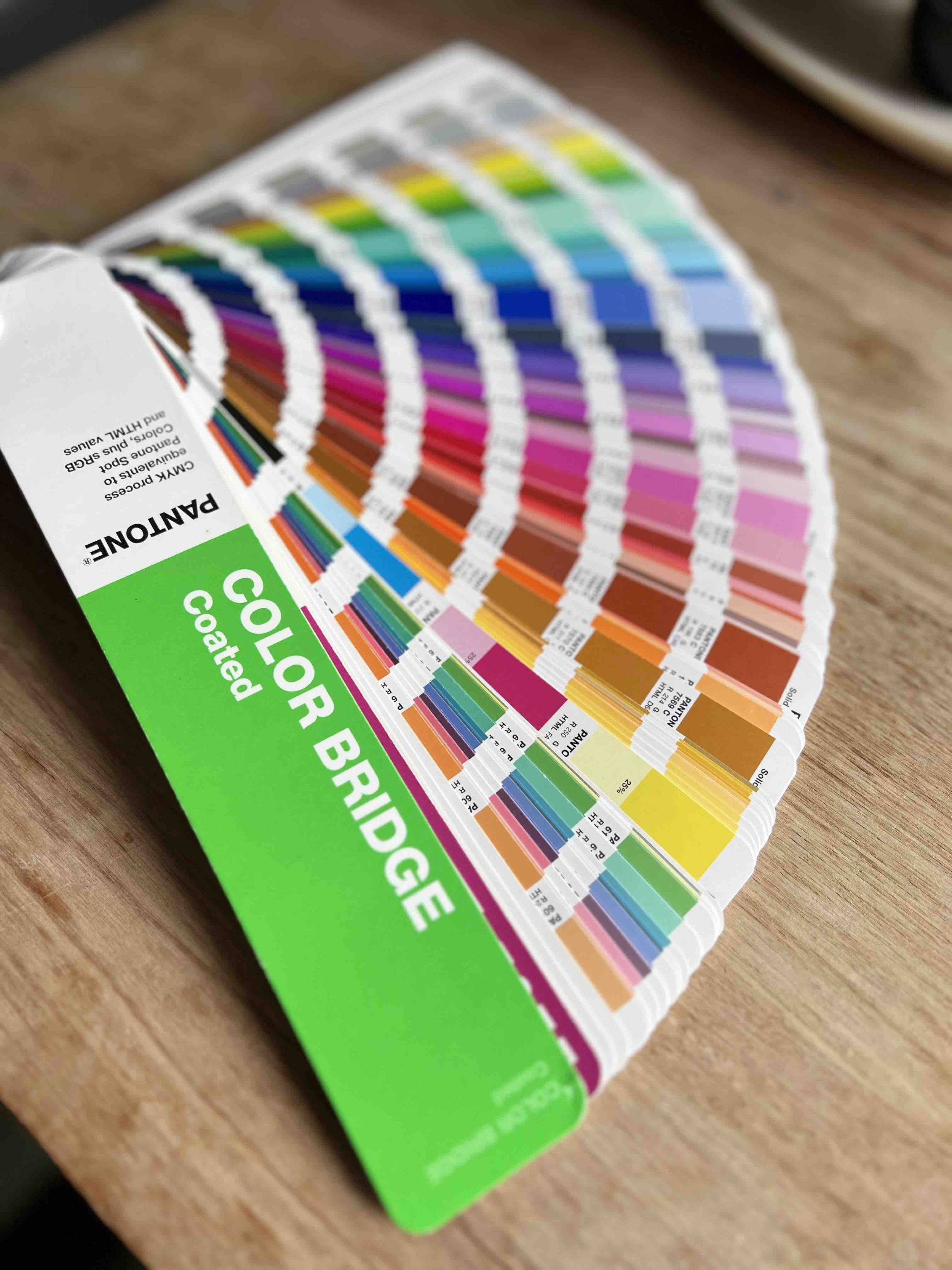
If you’ve ever wondered how to achieve perfect colour consistency, especially for branding, the Pantone Matching System (PMS) is your best friend. Pantone assigns exact colour codes to specific shades, ensuring that your colours look the same across all mediums—whether they’re on a billboard, business card, or website.
Pantone is especially valuable for brands that demand flawless consistency. For example, a brand’s signature red should look the same whether it’s printed on a brochure or displayed on a digital ad. By using Pantone colours, you eliminate the guesswork and ensure precision every time.
However, printing with Pantone does come at a premium. It’s more expensive than CMYK printing because it often requires custom inks. While it’s worth the investment for high-end branding, CMYK printing is an affordable and reliable alternative for most projects.
Why I Provide Multiple Colour Codes for Every Brand
When I design logos and visual identities, I make sure to provide clients with all the necessary colour codes to ensure consistency across platforms. These include:
RGB for digital screens
CMYK for printing
HEX for websites and online use
PMS (Pantone) for premium consistency
This approach ensures your brand colours stay true no matter where they appear, giving you a polished and professional look.
How to Achieve Colour Consistency
If you’re struggling to get your brand’s colours to match across different mediums, here’s what you can do:
Start with a professional visual identity: A well-designed brand should include a colour palette with RGB, CMYK, HEX, and Pantone codes.
Work with a designer who understands colour systems: This ensures that your colours are optimized for both screen and print.
Invest in Pantone printing if consistency is critical: For brands that rely heavily on their colours (think Coca-Cola’s red or Tiffany & Co.’s blue), Pantone is the gold standard.
Request a style guide: A style guide outlines your brand’s colours, fonts, and design elements, making it easier to maintain consistency across all platforms.
The Bottom Line
Understanding the differences between RGB, CMYK, and Pantone can save you a lot of frustration and ensure your brand always looks its best. Whether you’re designing for digital or print, having the right colour codes is key to achieving a cohesive, professional look.
If you’re ready to take your brand’s visual identity to the next level or need help creating a logo suite that’s consistent across all platforms, let’s chat! Your brand deserves to stand out—vibrant, polished, and unmistakably you.

